General
MSO chart settings are used to define settings to apply to a Microsoft Office Chart during the creation of a report document.
Properties
Every collection of MSO chart settings has the following properties:
Name |
Description |
|---|---|
| Chart Title | An optional Expression that returns a string that contains the title of the chart. |
| Primary Axis Min. Value | An optional Expression that returns the minimum value of the primary axis of the chart. |
| Primary Axis Max. Value | An optional Expression that returns the maximum value of the primary axis of the chart. |
| Primary Axis Line Color | An optional Expression that a single color or a single string that contains the CSS representation of a color that will be used for the line of the primary axis. |
| Secondary Axis Min. Value | An optional Expression that returns the minimum value of the secondary axis of the chart. |
| Secondary Axis Max. Value | An optional Expression that returns the maximum value of the secondary axis of the chart. |
| Secondary Axis Line Color | An optional Expression that a single color or a single string that contains the CSS representation of a color that will be used for the line of the secondary axis. |
| Series Line Color(s) | An optional Expression that returns one or more colors or strings that contain CSS representations of a color that will be used for the lines representing data series of the chart (see below). |
| Series Area Color(s) | An optional Expression that returns one or more colors or strings that contain CSS representations of a color that will be used for the areas representing data series of the chart (see below). |
| Transform Second Column To Series | When enabled, the second column of the exported table will be converted into individual columns (see below). |
Series Colors
By setting the properties Series Line Color(s) and Series Area Color(s) you can define which colors are used to render the lines and areas of the MSO chart. You can supply one or more colors by either specifying a color object using the RGB Function or CSS values.
The following expression returns a single color which will be used for the first series of the MSO chart using the RGB function:
RGB(255, 0, 0)
The following example returns a single color from a CSS value:
"#FF0000"
The following example returns a list of three colors using the CreateList Function; the first one being used for the first series, the second for the second series, and the third for the third series of the MSO chart. Again, the RGB Function is used.
CreateList(RGB(255, 0, 0), RGB(0, 255, 0), RGB(0, 0, 255))
You can also mix the RGB Function with CSS values:
CreateList("#FF0000", RGB(0, 255, 0), "#0000FF")
Transforming Second Column To Series
The reason why this setting exists lies in the different structure of tables with multiple dimensions when exported from e.g. Qlik Sense Datasources and the table format that the MSO chart requires. It only applies to tables with more than one dimension.
Example
Let's suppose you have a line chart with two dimensions Year and Country and one measure Sales in a Qlik Sense Datasources that looks like this:
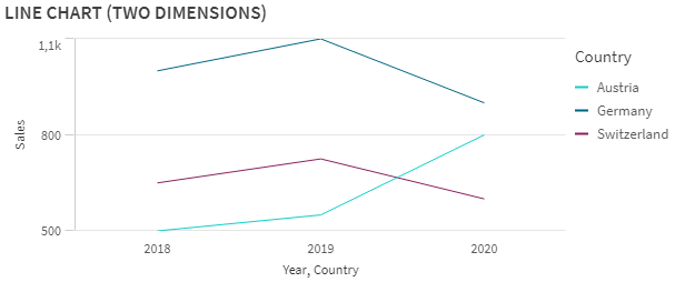
Line Chart with 2 Dimensions and 1 Measure in Qlik Sense
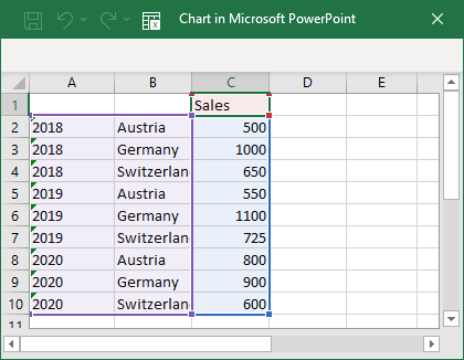
Default Table Format for 2 Dimensions and 1 Measure
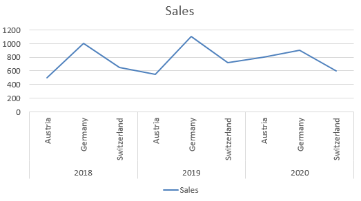
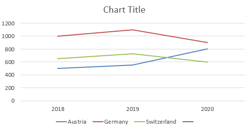
MSO Chart with Default Table
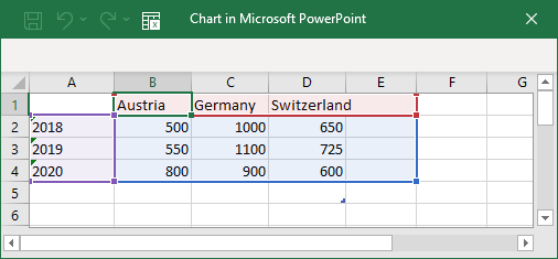
Transformed Table Format for 2 Dimensions and 1 Measure
MSO Chart with Transformed Table